Background
Challenges and Needs
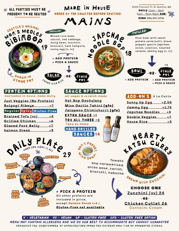
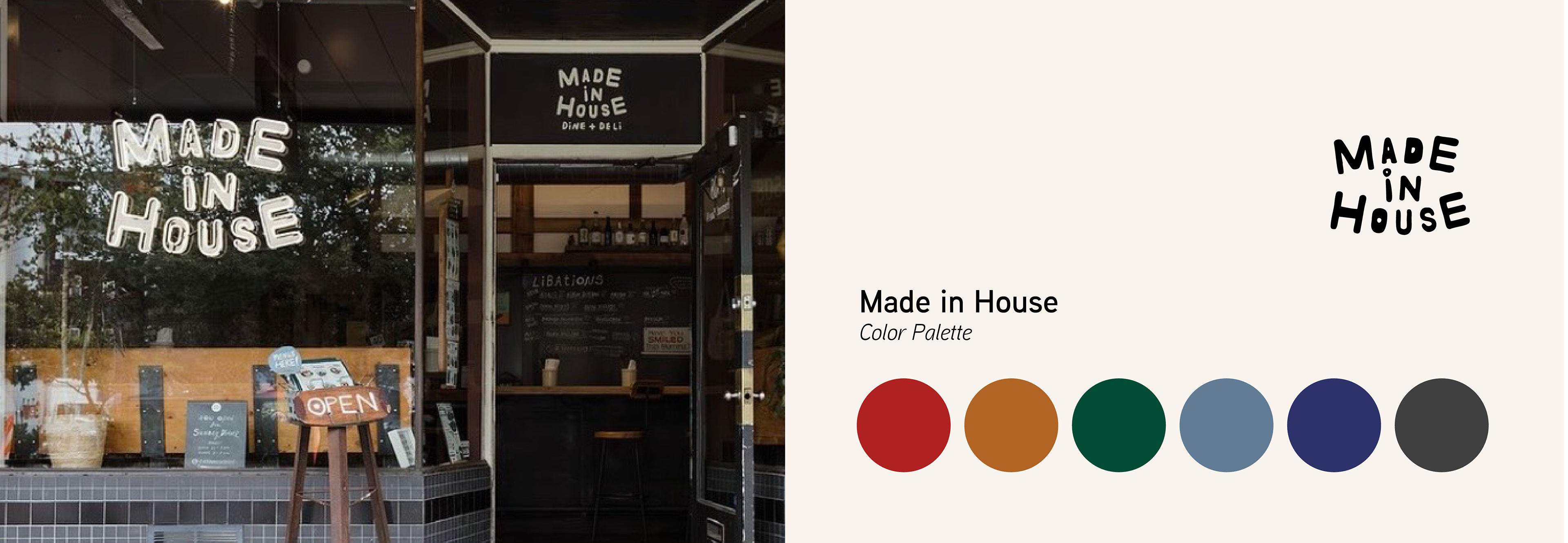
The restaurant wanted to preserve Made in House's playful, maximalist brand identity—including handwritten typography and dense layouts—while making the menu significantly easier to scan and read.
The biggest design challenge was organizing an extensive menu with photography and numerous customization options into a single cohesive document. Because the restaurant uses a fast-paced counter-service model, guests often had only a few moments to decide before ordering, leading to missed menu items and frequent clarification questions from staff.
Previous Menu Design
Solutions
Clear visual hierarchy:
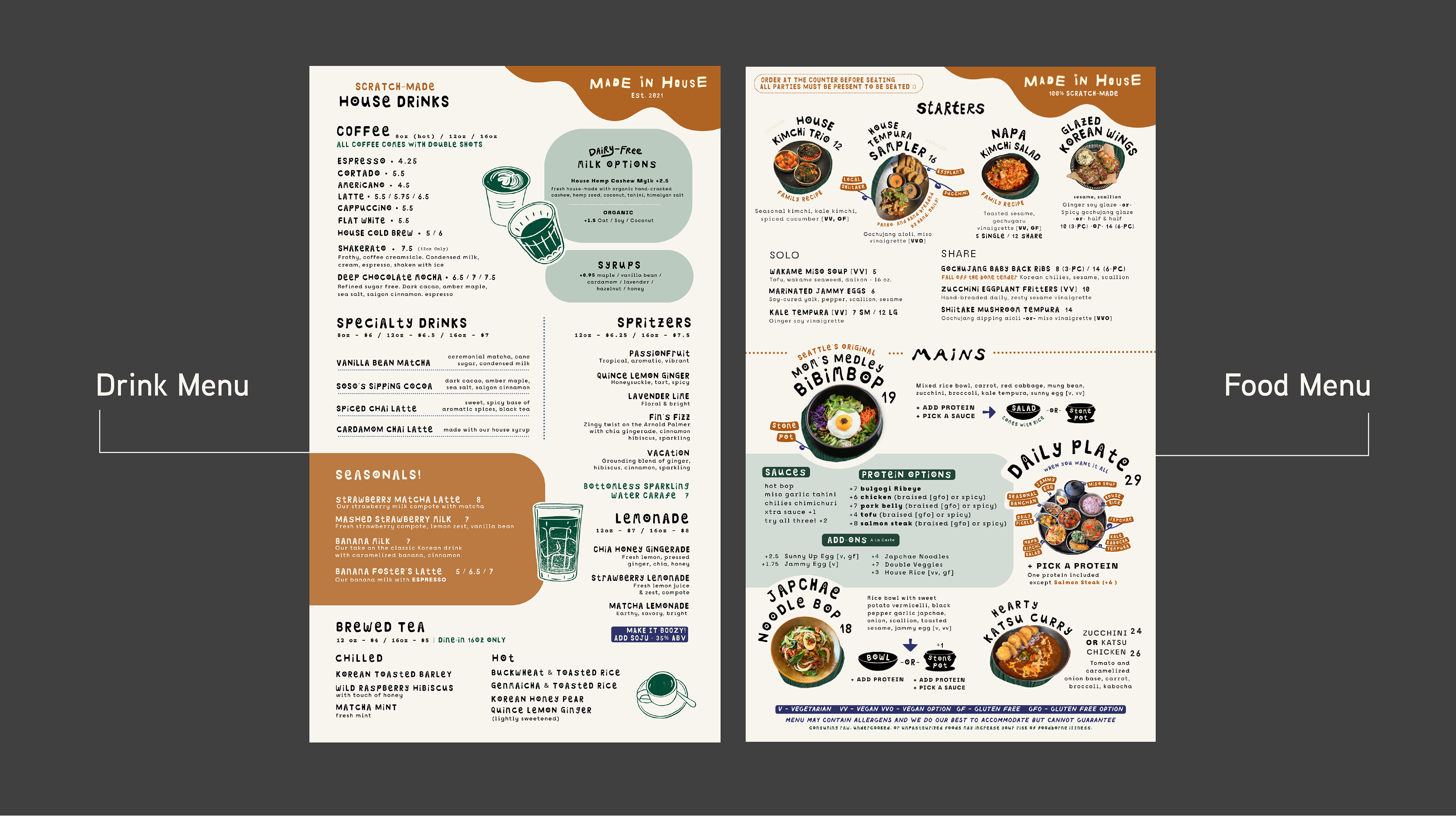
I reorganized the menu into distinct sections with stronger headers and quieter supporting typography, making key information easier to find at a glance.
I reorganized the menu into distinct sections with stronger headers and quieter supporting typography, making key information easier to find at a glance.
Intentional use of white space:
While respecting the client's preference for a dense, whimsical aesthetic, I introduced strategic spacing to improve readability without sacrificing the brand's personality.
While respecting the client's preference for a dense, whimsical aesthetic, I introduced strategic spacing to improve readability without sacrificing the brand's personality.
Structured layout system:
I built the menu on a consistent grid, removed distracting rotated elements and centered text, and organized customization options so guests could quickly understand available choices.
I built the menu on a consistent grid, removed distracting rotated elements and centered text, and organized customization options so guests could quickly understand available choices.
Results
Staff immediately noticed less questions at the register, with more guests indicating sauce and protein choices without prompting.
Beverage sales reached record highs after launching the redesigned double-sided menu, which gave drinks equal visibility alongside food offerings.
Higher check-averages: an increase in check averages was documented after menu release, contributed to us by intentionally highlighting higher-priced and easy to add-on items.